Quick + Easy Ways to Give Your Squarespace Website a Refresh
As a busy female entrepreneur, you don't have hours to spend completely re-designing your Squarespace website. But the thing is, "75% of users judge a company's credibility by its website." (websitebuilderexpert.com). With that being said, it might be time to give your website a bit of a refresh without having to commit days to do so. This blog post will take you through easy ways to update your Squarespace website as a busy female entrepreneur so that you can spend your time doing tasks that will make you more money! Your website can be a money-making machine, and I want to help you get there. So pull out your favourite notebook and let's get started! Before we jump in, here is a brief overview of five things you can do to refresh your Squarespace website in no time at all.
Switch out old images for new ones
Update your colour palette
Add new work to your portfolio
Add new testimonials (and make sure they stand out!)
Create coloured and fun backgrounds for each section
Create new header images
One of the first things people see when they land on your website are your header images. You'll hear website designers often saying to optimise your "above the fold" content, this means that the very first thing your website viewers see when they land on your Squarespace site are images, text, and animations that will make them want to keep scrolling - both on desktop and on mobile (you can read about one of my favourite ways to optimise your site for mobile view in this blog post.).
Here’s a visual example of what above the fold content is, and what a header image could look like:
Creating new header images for your website can be as easy as setting up your phone with a tripod and self-timer and snapping some new shots or looking at online stock photo resources like Unsplash or Pexels. If you want some premium stock photo resources, I suggest checking out Haute Stock and Honey Social Co! You can also create unique collages by using Canva if you want something that stands out a bit more.
Update your colour palette
Going right along with creating new header images for your website is updating your colour palette! These two go hand-in-hand, so if you decide to do one don't forget about the other! There's a lot that goes into updating a colour palette in a strategic way that will resonate with your target audience, so let's talk about three things to consider when updating your colour palette.
Colour Psychology - what feelings do you want people to have when they visit your website? How do people currently describe your brand? What are the core values of your business? Asking yourself questions like these can help you choose colours with a psychological background that will resonate with your audience so that they feel right at home once they land on your website. This will also help them to continue moving on around your website and check out more pages, who knows, they might end up even inquiring about working with you! Does the term colour psychology freak you out? No worries! I actually think it’s totally fine to take a more intuitive approach to selecting colour palettes - if you answer the questions above and keep all of that info in mind when selecting your colours, chances are you will naturally feel most aligned to the colours that connote the right mood and vibe for your business. You can always refer to this chart to check you’re on the right track and make a few tweaks to your palette if you feel it’s needed.
Target Audience - Think about the people you want to work with, what colours will they be drawn to? For example, someone in the wedding industry might use colours like white, ivory, blush, and more because those colours are commonly associated with that specific niche. On the other hand, if you are trying to target fitness coaches pinks and whites might not be the way to go! As you can see, colours have the ability to attract certain people. So make sure that when you choose a colour palette for your business it will attract the right audience!
Timelessness - it's easy to get sucked into the world of Pinterest pins and industry trends, but when you base your new colour palette on such things, you'll find yourself needing to rebrand your business often! An easy way to avoid following the crowd when it comes to your colour palette and branding is to think about the big picture. What are your biggest business goals? Where do you see yourself in one, three, or even five years? The answers to questions such as these will help you to make decisions that help you plan for a successful future in your business. Don't think just about your goals from month to month or quarter to quarter, I want you to reach the biggest and scariest goals you have in business!
Update some of the other images on your SQUARESPACE website
Now that you have new header images and a colour palette for your website, it's time to update the rest of the pictures on your website! This can include...
Pictures of you and your lifestyle images on your about page
Portfolio pictures of your work
Update any stock images throughout your website
Updating the images you're using throughout your site will help you to create a consistent schedule presence on your website so that your ideal client always knows they're in the right place and can continue to form a relationship with you, without you even having to be there!
Update your portfolio
This can be a tedious task and an easy one to forget about! This is so important because the more projects you work on, the better your portfolio can be. You can diversify your portfolio and add more projects that show visitors your whole skillset. This is also a great chance to make sure that any links in your portfolio are still working. Broken links can hurt your Squarespace SEO rankings if you want to rank higher on search engines!
Updating your portfolio gives you the chance to share content from some of your favourite projects so that visitors know who your ideal client is and what you're capable of creating for them. These can be recent projects from your clients, but it can also be personal projects that you loved working on.
I also suggest adding a "next steps" or "how it works" section to your portfolio or services page so that potential customers on the page know what to do so that they can enquire about working with your business.
Add new testimonials
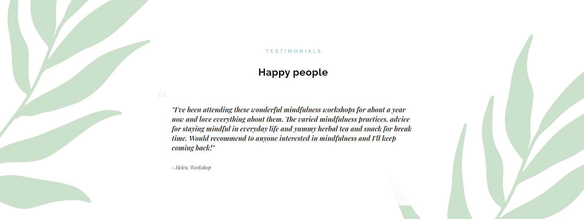
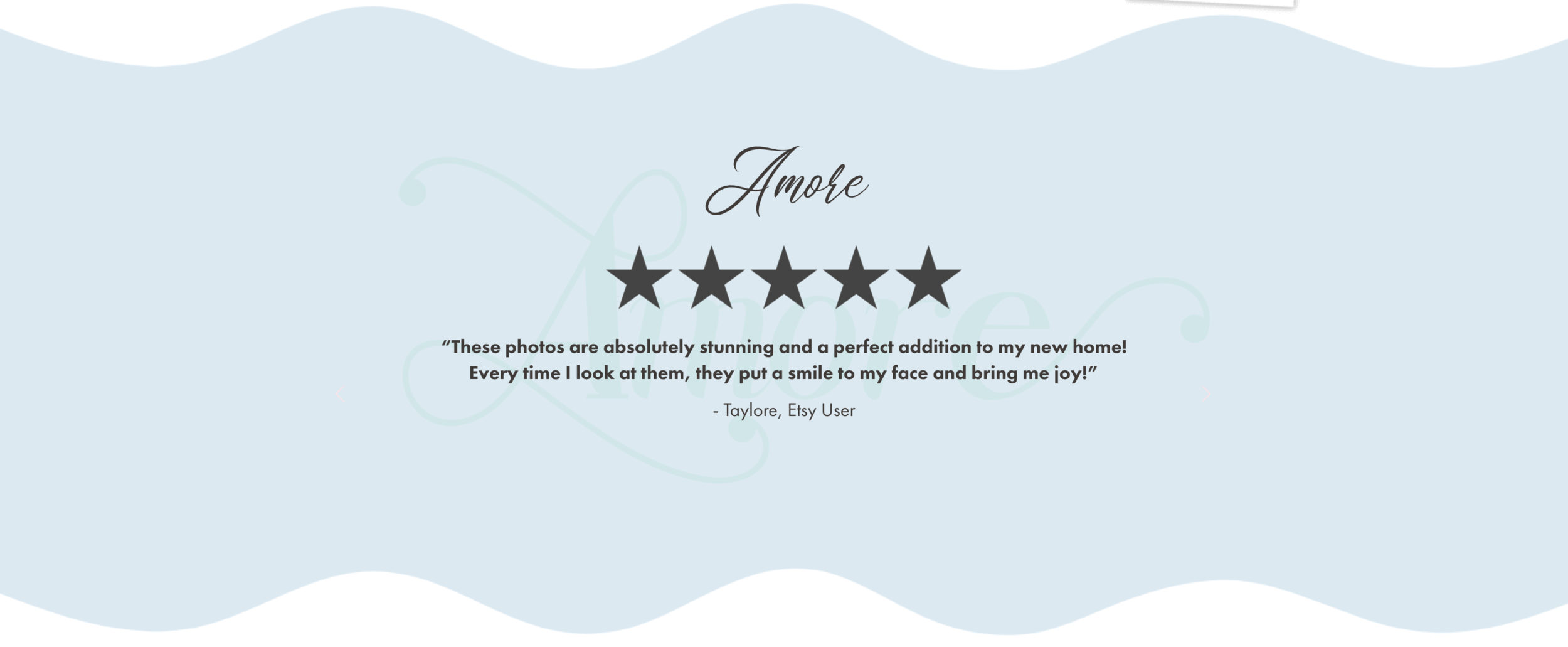
Testimonials are an invaluable way to promote your business. Make sure these are really emphasised on your site with a unique design that helps them stand out in the minds of your ideal client. There are tonnes of creative ways to creatively display testimonials to your website. Here are some of my faves design elements to include!
Background images
Big quote marks
Sliders & animations
Headshots and links
If you’re a Squarespace user - try out incorporating a carousel summary blog to showcase multiple testimonials and add a fun interactive element to your site. Check out this post from Big Cat Creative on how to do this!
Here are a few examples of testimonials I’ve designed for some of my previous clients:
Create coloured backgrounds to break up your website text
Background sections in Squarespace allow you to split your website content into different sections so that it's easier and more appealing to look at and read. All Brine family templates in Squarespace 7.0 allow you to add different sections to pages, which are known as index pages.
If you're using 7.1, all templates have the same functionality and all of them have index pages (now known as sections) whoop! This means that you hardly have to worry about it - just choose a new colour from your new colour palette and you're all ready to go! You can also add images or videos to the background. Videos are a great way to draw people in and keep them looking at your website for longer.
There's a strategic reason as to why it's beneficial to break up your text into sections. This helps improve user experience so that your website visitors remember their time on your website positively. By setting up each section of your Squarespace website intentionally, you can draw attention to key features and information that would influence potential customers into working with you over someone else within your niche.
To do this on Squarespace 7.0 Brine family templates, each index section is given an ID that is the same as the section slug. But hold up - what's a URL slug?! It's simply the unique URL for that section.
To find the slug for the section you’d like to change the background colour of, go to the Pages menu, click on the settings gear icon next to the section you want to target. In the settings menu, the URL Slug is what you're after. Simply replace the slash / with the # sign and you can target that section. Once you’ve found the URL slug, copy and paste the following code into the CSS editor:
#URLSlugHere {
background-color: #00000;
}
Action Step: Simply replace the "URLSlugHere" text with the slug of your index section, and add in your hex code colour.
If you'd rather not play around with coding on your website, you can create a coloured image in Canva or another design software and upload that coloured background as an image.
Pro tip: Compress your image file size by using a tool like tinypng.com or tinyjpg.com so that this image file doesn't negatively impact the loading time on your website (which is also bad for search engine optimization).
But like we established in the very beginning of this blog post, you're a busy woman running her own business as an online entrepreneur and might not have time to update your Squarespace website to make sure it stands out from competitors! If you'd rather leave the changes to an expert, check out my Squarespace Website Makeover Package! This is perfect for creative female entrepreneurs and online business owners who already have a Squarespace site setup but are looking for a designer to wave their magic wand and give it a makeover! If you're ready for a completely new website but aren't ready to invest in a totally custom site, then my Stand Out Squarespace Website Templates are the next thing you need! Learn more by getting on the waitlist below!
psst…did you know i’m working on a new + improved collection of squarespace templates?
These templates are built using the new drag and drop Squarespace editor - Fluid Engine and have all the latest and greatest Squarespace features, plus some additional pages and loads of extra goodies! Sign up to the waitlist so you can be the first to hear when they launch plus get access to exclusive waitlist discounts and bonuses! 👇
Did you like this post? Then pin it to Pinterest! 👇


