How To Survey Your Audience On Autopilot
If you’ve been in this online business world for more than a hot minute, then I’m sure you’ve read all about the importance of understanding your audience. You’ve probably been told time and time again how you should survey your audience and do regular market research to ensure you’re connecting with them the best way you can. If you're a bit of an introvert like me, then this whole concept might sound a bit intimidating. Maybe you’re a bit of a business newbie and in all honesty, aren’t entirely sure WHO your audience is, HOW to actually speak to them or WHAT to actually say. If this sounds familiar, then don’t worry - I got you! You’ll be pleased to hear, there’s a simple way to collect market research by surveying your audience on autopilot! Yep, you heard right! You can literally get a VIP backstage pass to your audience’s thoughts while you sleep! Amazing right?!
Today, I’m going to walk you through how to do this step by step on your Squarespace website. Even if you’re not a Squarespace user, I’m sure you can get some inspiration to set this up on other website platforms, or it can at least give you some ideas to implement on your own site in the future. I’ll also go on to recommend the best questions to ask and my top tips for getting as much engagement from your survey as possible!
You ready?! Let’s dive in!
How to survey your audience on autopilot on your Squarespace website by setting up a survey form.
I’m going to show you how to set up a survey form after a visitor contacts you or signs up for a freebie or your newsletter on your Squarespace website. We’ll do this by setting up a post-signup form re-direct page and linking that to your website form. It might sound a bit complex, but I promise if you stick with me I’ll show you how easy it is to do!
Step 1 | Create a new un-linked blank page on your Squarespace website.
Name your new page something like: “Survey form re-direct page”
Step 2 | Add content to your page
I would recommend adding a thank you message at the top that lets them know how long they should expect to wait until they receive your freebie/receive a response from you - or whatever message is relevant to the form you’ll be linking this page to.
Then, add some text asking them to answer a quick survey so you can serve them better with free content and services/products in the future!
Here’s an example of the text from one of my survey pages:
You can view this page in action here.
Step 3 | Set up your survey form
Right, now the intro text is done, let’s set up the survey form!
Click on an insert point underneath your intro text & select “form block”.
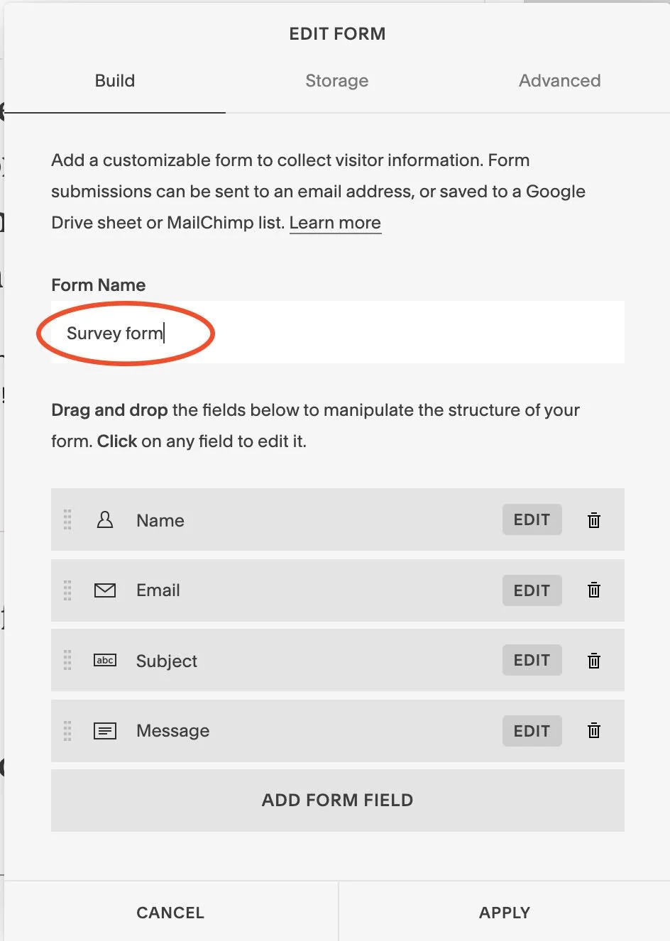
Name your new form.
Add in a series of text entry fields and add in the questions you want to include in your survey.
Delete the name/email/contact details fields (assuming you want to keep the feedback anonymous).
Click on the storage tab and select where you’d like the info to be saved.
I find a Google Sheet doc on my Google Driver folder works so well for this! By selecting this option, it means every time someone fills out your survey form, the answers will automatically be saved onto your Google Sheet without you having to do a single thing! Amazing right?! You can also choose to link up the email address associated with your GDrive account too and have email notifications come through every time someone fills out your survey (this bit is optional).
Step 4 | Link up your thank you page
Now your thank you page and survey form is all set up, it’s time to do the final step and link this up to another form on your website. After a visitor comes to your site and fills out their details on your freebie/newsletter form or your enquiry form, instead of displaying an automated thank you message, we want the visitors to be redirected to your new thank you page and survey form.
Here’s how to do that:
Go to the page where your other form is located, go into edit mode and hover your mouse over the form block to bring up the ‘Edit’ option. Hit edit.
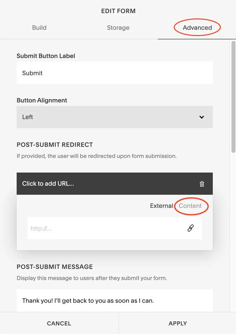
Click on the ‘Advanced’ tab.
Click ‘Content’ and scroll down to find your new thank you page & survey form - select the page.
Hit ‘Apply’.
Hit ‘Save’.
Now head to your live site and test it all out! Fill out your form and then complete your survey form. Make sure to check all the answers from your survey form link up to your Google sheet doc too. And you’re all done!
I have loved using this approach for market research, it suddenly makes the whole process a lot less daunting and is a great way to start seeing where your website visitors are at and what they might want to see from you in the future.
This process is a bit of a slow burn. Especially if you’re new to business and don’t get much traffic to your website. But, the great thing about it is you can literally set it and forget it and watch the answers build up over time! Whoop!
What questions to include on your survey form
Now, you may be thinking, well that’s great Kate. I know how to set this thing up, but what exactly should I ask my audience? Good question! I’ll give you some tips and recommendations I’ve picked up along the way to encourage engagement from your audience.
When you strip everything back, attracting your dream clients to your offerings all really comes down to two key things: understanding their biggest struggles when it comes to your offerings & understanding what their life would look like after these problems were solved.
If you think about it, when you visit a website, why are you visiting that site? Whether you’re looking up local cafes in your area to go for some lunch, searching for a birthday gift for your friend, shopping for a new outfit for your cousin’s wedding, looking for recipe ideas, looking for some free business advice (you’re in the right place for this one!)...whatever it is, chances are you’re looking for a solution to a problem! OK...so maybe that excludes watching cute dog videos on Youtube, but even then I’d still say you’re seeking some escapism/distraction so technically even THAT is solving a problem!
I’ll say it before and I’ll say it again (and probably many more times and I’m not even sorry about it!) if you can position your business as being the no.1 solution to your audience’s problem and paint a picture of the transformation you can provide them, then you’re going to have customers queuing down the street to buy from you.
Sooo...how does this relate to the questions to put on your survey form? It’s simple - ask them what their no.1 biggest struggle is in relation tho your offerings right now!
Here’s an example of the questions I use on my own survey form:
What type of business do you have and what industry are you in?
What's your no.1 biggest struggle when it comes to your brand and/or website?
What would your life be like if this problem was solved?
If there was one freebie/digital product that would help you solve a major website building problem, what would it be?
And that’s it! Once you can show your audience that you truly understand their problems and desires, they’re going to feel like you get them, you’ll build trust, form an instant connection and they’ll 1000% want to stick around to learn more from you.
Survey form tips
Now, this is not over yet! Before you go, I wanted to share a few tips I have to encourage as many people to fill out your survey form as possible. I’ve tried out various different survey questions in the past, and from much trial and error, here’s what’s worked best for me.
Keep it short, simple and to the point!
Only ask the most valuable questions and keep your questions simple and direct. You want your visitors to think the form will be very quick to fill out, with minimal brain power involved, and won’t take up too much of their time.
Don’t give guidance
If you ask your audience what their biggest struggle is in relation to your offering, don’t then proceed to give prompts and suggestions - we don’t want to influence them in any way or assume we know what they might be thinking. If you offer suggestions, chances are they’ll just pick one of the things you’ve listed down. We don’t want that!
Don’t ask for multiple options
This is really an extension of the first point. But, when asking your audience what their biggest problem is in relation to your offering, make sure you’re only asking for their single biggest problem, we don’t want them to list out alllll of their problems. Just the no.1 biggest one that they struggle with the most. Asking for more than one thing might put your audience off completing the question or they may just give you some vague answers that don’t hold too much value or meaning.
Why you should include your survey form on your thank you page
Andddd finally, I wanted to share why I think the thank you page is SUCH a great place to put your survey form. In my opinion, the thank you page is one of the most underrated website pages, and if you’re not using them currently, you’re missing a trick.
If you think about it, thank you pages are a place that potential customers are guaranteed to see right after they’ve enquired with you or downloaded a freebie - this means they’re interested in learning more from you, they’re in a prime situation to want to engage with you and your services. There are plenty of other ways you can put a thank you page to good use, but that’s a blog post for another day!
There you have it! My favourite way to get to know your website visitors on autopilot. Once you’ve set this baby up, you can regularly check to see what answers have come in and use this a guide to inform future content, freebies, blog posts, services, products and more! I really hope this blog post was helpful for you, if you have any questions please do get in touch!
Now, before you go. If you’re struggling to connect with your dream clients or unsure of what to put where on your website, I have a free anatomy of a dream client converting homepage guide that you can grab right now!
Did you like this post? Then pin it to Pinterest! 👇


