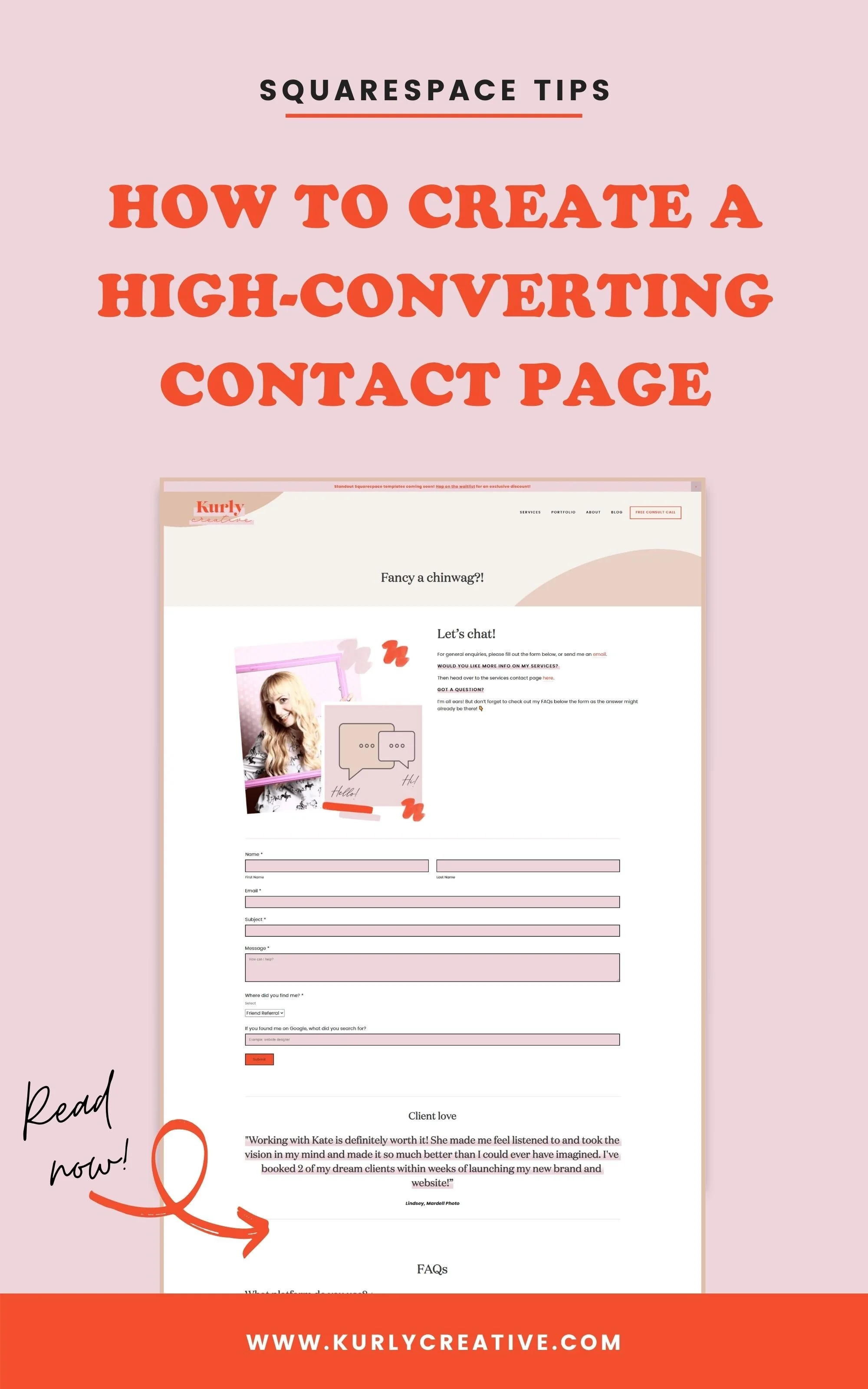
5 Ways to Brighten Up the Most Underrated Page on Your Squarespace Website
What's the most underrated page on your website? Good question! Personally, I believe that the contact page on your Squarespace website is one of the most important, yet overlooked pages on a website. This page is often an after-thought that people throw together with just a simple contact form then call it good.
In reality, this page is a great opportunity to show your personality and convince people that working with you is too awesome of an opportunity to pass up. In this blog post, we are going to talk about the importance of a custom contact page with more than just a form and then five ways that you can make a contact page on your Squarespace website that will blow everyone away!
Why do I Need a Contact Page?
As a female online entrepreneur, a contact form is a way for people who are already interested in your services to get in touch with you. Take advantage of these warm leads by making a custom contact form and page that will keep people feeling welcomed on your website.
This page can help you prequalify your leads and even attract more clients since they'll know how to get in touch with you! You can set up automatic inbox filters so that you can stay organized and on top of every enquiry you receive. Adding in a means of authentication can also mean that you reduce spam emails that aren't sent from genuine humans who truly want to work with you.
Now that you know why a contact page is so important for your Squarespace website as a digital, service-based business, let's talk about five ways that you can refresh that boring contact form and bring the page to life without you even needing to code anything!
01 | Add a Picture of You
When people are able to see a picture of your face, they form an even greater personal connection between your brand and their business. Reassure your potential customers that they are in the right place and are making the right decision as they press that "submit" button.
Now, I don’t mean any old picture. And certainly not that dodgy mugshot you took 8 years ago for your passport photo...or that photo of you at a family wedding with most of your Nan and Grandad cropped out of it. I mean a lovely smiley picture of you wearing clothes that you love to wear (bonus points if you wear something that matches your brand colours!). Are there any props you can use that instantly tells a story or shows a little insight into your life? Whether it’s your fave mug that you endlessly fill with coffee each day, your trusty notepad or even your precious fur-baby - experiment with different props that add that personal touch and bring your pictures to life.
Adding a picture of you will help to humanise your brand and subconsciously reassure people that there is a real life human behind the contact form that will be happy to hear from them!
02 | Include an FAQs section
Potential or existing clients may have some questions about what it will be like working with you. Do your best to collect the most common questions that people ask you and then create a frequently asked questions section on your contact page.
Now, if you know me, you know I like designs and website that are far from boring. So we are going to do more than just build a plain FAQ section. We are going to make this strategic! Think about your dream client and ask yourself questions like...
Why are they reaching out to work with me in the first place?
Are they apprehensive about outsourcing? Why?
What objections will your dream client raise about working with you?
When you answer these questions, make your users feel understood. Don't write in a way that will make them feel bad or embarrassed about the feelings they have. Share your own experience and how your services have helped yourself and others. There's another great way to show the effect of your services on others, which brings me to the next point!
03 | Sprinkle in Some Testimonials
When people are looking to purchase a product or service, they want to make sure that it's going to be money well spent. This is why testimonials are so important for the success of your business! Try to diversify your testimonials and not just use the same ones all over your site. When people can read testimonials, they can relate to the struggles your past clients were facing before they worked with you. Then, they can see how your services have helped to solve their problems and move the needle forwards in their business.
Testimonials show your credibility and position yourself as an expert. This can make people feel at ease and realise that when they hire you, they will be investing in something that will help them take their business to the next level!
04 | Add in Next Steps
Show people that you're super grateful for them reaching out to you and tell them what they can expect to happen next. You don't want to leave people in the dark and risk leaving money on the table because you weren't clear about what's next! To do this, outline your next steps. Here's one way that you can do this!
Start by telling them when they can expect to hear back from you. This is another small touch that respectfully shows that there's an understanding human behind the contact form they're submitting. Give a timeframe that allows you to honour the boundaries you've set within your business while still getting back to your leads in a timely manner.
Once you review the contact form they've submitted, what is going to happen next? If you'll reach out to schedule a call, tell them what to expect on the call.
If you send them a proposal to approve before they sign the contract and pay a deposit, let them know what will be included in the proposal. This is always a required step for every kind of business!
The final steps in the process are usually signing the contract and paying the invoice. If this is true with you, outline on your contact page what they'll need to do to confirm their spot in your schedule.
Lastly, many business owners like to kickstart a project with a video call where they outline the specific timeline and project details once a client has signed on. Hype people up and get them excited by telling people how this call leads to tonnes of awesome things!
05 | Bonus! Add a Redirect
If you want to go the extra mile and really blow people away, then you can create a clever thank you message and redirect potential clients to read your blog, download a freebie, or even another testimonial to sound down the fact that they just did something awesome by reaching out to you. Another option is to include your Instagram where they can follow along (or stalk) your account to learn about you personally. Social media links can help people relate to you more as a human and not just another business owner looking to make some money.
If you're wondering how to do this, then click here to read my blog post all about it! Here are three simple steps that you can follow to do it yourself...
Step 1 | Create a new un-linked blank page on your Squarespace website.
Step 2 | Add in the Content you want to include after someone has submitted your contact form.
Step 3 | Link up your thank you page
Carrying it Out
Now that you know all the ingredients that go into creating an awesome contact page, you have to actually build it. This can be the not-so-fun part of things. If you're struggling to take what's in this blog post and carry it out on your website, then I have a solution for you! My Standout Squarespace templates are perfect for female entrepreneurs and service-based businesses looking to take their business to the next level without draining their bank account.
Head on over to Creative Market to check out all the products! 👇
Did you like this post? Then pin it to Pinterest! 👇


